Have you signed up to an online service for a free trial, decided it isn’t for you, but still ended up paying for it months – or even years – later? Or tried cancelling a subscription, and found yourself giving up during the painstaking process? If so, there’s a good chance you have encountered a “dark pattern”.
Dark patterns are clever tricks built into apps and websites to encourage you to do things you may not necessarily want to do. They make it easy to “accept all” tracking cookies for example, and swiftly agree to terms and conditions while you hurry along with making your purchase.
They also make it easy to sign up to a service – but time consuming and frustrating to leave. And our recent research shows how most of the time they benefit companies at the expense of consumers.
This imbalance has not gone unnoticed by regulators. The US Federal Trade Commission (FTC), which aims to protect consumers from unfair business practices, believes an increasing number of companies are “using digital dark patterns to trick people into buying products and giving away their personal information”.
For instance, the FTC is currently investigating Amazon over its alleged use of dark patterns to enrol customers into its Prime service, while making it difficult for them to leave. Our research supports the agency’s observation that “consumers who attempted to cancel Prime were faced with multiple steps to actually accomplish the task of cancelling”.
In a statement on its website, Amazon said the suit showed the FTC’s “misunderstanding of retail”. It also said: “We make it clear and simple for customers to both sign up for or cancel their Prime membership.”
Read more:
US regulator is suing Amazon – here’s what this could mean for your online shopping
The FTC is not alone in its concerns about dark patterns. The EU recently passed legislation which can be used to fine companies that use dark patterns, and the UK’s Financial Conduct Authority has launched rules designed to protect consumers from dark patterns in financial services.
Meanwhile, the UK’s Competition and Markets Authority (CMA) recently announced its first investigation into dark patterns with an open letter warning business against what it calls “harmful online choice architectures”.
“Choice architecture” is a term coined by the authors of the extremely popular and influential book Nudge. They describe it as the “the design of different ways in which choices can be presented to decision makers”.
For instance, a “choice architect” could help a consumer by reducing the amount of irrelevant information presented to them, allowing space for a considered, focused decision to be made. But most dark patterns work by manipulating choice architecture.
Rather than helping consumers, the architecture is designed to hinder choice. So instead of removing irrelevant material, it may bombard a user with excessive information, extra steps and distractions to stop them cancelling a subscription.
As the CMA notes, in today’s online world “businesses can design and control every aspect of their interactions with us to an extent that is unprecedented in traditional brick and mortar businesses”.
Research suggests the CMA is right, and that online companies have an almost unlimited ability to refine their interactions with consumers. Online experiences are increasingly personalised, and tech-savvy firms have more ways than ever to engage with – and manipulate – us.
Seeing the light
And while regulators tend to focus on dark patterns as a way of getting consumers to part with their money or data, others have expressed concerns about potential psychological harms and a loss of freedom by users of online services.
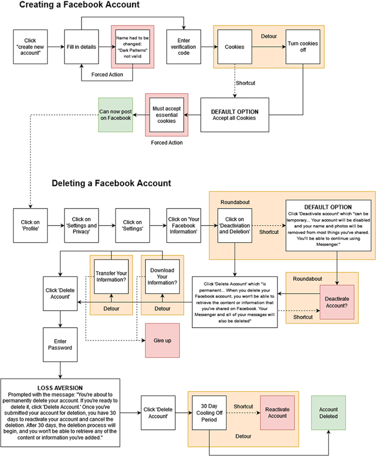
With these risks in mind, we have used insights from behavioural science to identify some of the processes which make dark patterns work and created a simple framework to describe the most pervasive strategies. “Detours” for example, is the name we have given to the tools used to delay and distract us, such as requiring an excessive number of actions to cancel a subscription.
“Roundabouts” try to bore or frustrate us to the point of giving up, like clicking on link after link, taking users round in circles. And “shortcuts” offer an immediately easy – but potentially costly – choice, like the “accept all” buttons on cookie prompts or requests to accept terms and conditions. In one study, a particularly long terms and conditions document led 98% of participants to agree to hand over their firstborn child as payment.
Author provided., Author provided (no reuse)
Our framework of terms is designed for simplicity – to empower consumers to spot dark patterns themselves, and to help regulators intervene. For the freedom to create and delete accounts for a service is a fundamental step in navigating the online world.
And it should not be drastically more straightforward to set up a social media account than it is to delete it. There is no good reason for detours, roundabouts and shortcuts to get in the way. We believe it should be as easy – if not easier – to delete an account as it is to create one. Most of the services we examined failed this standard.
Without consumer push back and regulatory muscle, the online world is likely to become even harder for ordinary people to navigate. On the plus side, regulators seem to be stepping up, and new tools for protecting consumers from dark patterns are emerging. There may yet be light at the end of this manipulative tunnel.
Credit: Source link


